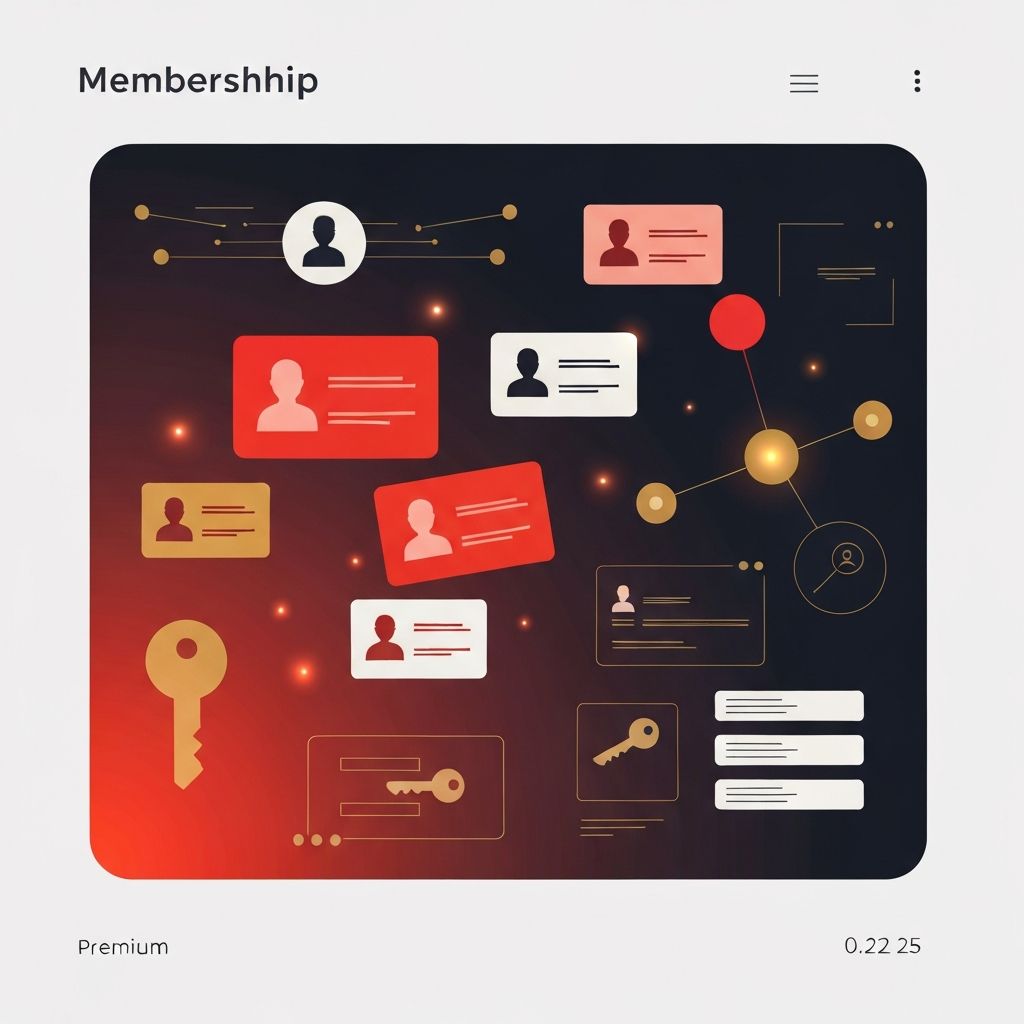
What Makes Membership Web Design Unique
A membership website is fundamentally different from a typical content or e-commerce site. Its success is not measured in one-time transactions but in sustained engagement over months and years. Every design decision must consider two distinct journeys: the prospect evaluating whether to join, and the member returning again and again to extract value from the community, content, or services inside. Get either journey wrong and the business model breaks. Get both right and the website becomes a compounding asset that grows more valuable as the member base expands.
Membership models span an enormous range—paid content libraries, professional associations, fitness communities, fan clubs, software-as-a-service platforms, alumni networks, and creator-led communities, among many others. Regardless of vertical, the design challenges share striking similarities: clearly communicating value, reducing friction at signup, personalizing the logged-in experience, and keeping members active long enough to renew.
Hire AAMAX.CO for Scalable Membership Web Design
Organizations building or rebuilding their membership platforms frequently partner with AAMAX.CO. They are a full-service digital marketing company offering website development and web application development services worldwide, with experience engineering membership sites that scale gracefully from a few hundred members to hundreds of thousands. Their team understands the dual nature of membership design, balancing marketing-focused public pages with robust member dashboards, billing integrations, and community features that feel seamless across devices.
The Public Funnel That Converts Curious Visitors
Before anyone becomes a member, they are a visitor deciding whether the promise is worth the price. The public-facing portion of a membership site must communicate value with uncompromising clarity. This usually means a strong hero section that names the target member and the transformation offered, social proof from current members, a plainly laid out benefits list, and pricing that does not require a calculator to understand. Tiered pricing, if used, should make the recommended plan obvious, and comparison tables should emphasize outcomes rather than feature lists.
Free content samplers, trial periods, and “peek inside” videos lower the risk of joining. FAQ sections written in authentic member language address the real objections prospects have, not the ones marketing teams assume they have.
A Frictionless, Honest Signup Flow
Once a prospect decides to join, every additional field, page, or delay is a chance to lose them. The signup flow should ask only for what is strictly required to start the membership, defer everything else to post-purchase onboarding, and clearly state what happens after payment. Transparent pricing—no hidden fees, clear renewal terms, and easy cancellation policies—reduces buyer’s remorse and builds the trust that supports long-term retention. Modern payment processors, saved payment methods, and flexible billing cycles all contribute to a smoother commercial experience.
Onboarding That Delivers Early Wins
The days immediately following signup are the single most predictive period for long-term retention. An onboarding flow that helps new members achieve a meaningful first win—completing a profile, consuming a starter course module, introducing themselves in the community—dramatically improves the odds of renewal. Well-designed membership sites treat onboarding as a guided experience, not a dump of documentation, with progress indicators, gentle email nudges, and content personalized to the member’s stated goals.
The Logged-In Experience
Once a member logs in, the site transforms. The public marketing messaging fades, replaced by a personalized dashboard that surfaces what the member should do next. Recent activity, recommended content, community notifications, and clear navigation into the member’s most-used features should all be immediately visible. Search must be fast and forgiving, filters must match the way members actually think, and on mobile the entire experience must remain fully functional rather than stripped down.
Design systems matter enormously here. With hundreds or thousands of pages across member content, community threads, course modules, and account management screens, consistency of components, typography, and spacing is what keeps the site feeling cohesive rather than sprawling.
Community and Connection
Many of the most successful membership sites succeed because the community becomes as valuable as the content. Discussion forums, member directories, live events, cohort-based programs, and peer-to-peer messaging all contribute to the sense that members are part of something rather than merely subscribing to something. Design must make participation inviting rather than intimidating, with clear etiquette guidelines, thoughtful moderation tools, and interfaces that reward contribution.
Access Control, Roles, and Permissions
Behind the scenes, membership sites run on sophisticated access control. Different tiers see different content, some sections require specific permissions, and administrative users need their own interfaces. Designing these permission boundaries so they feel natural to members—rather than making them feel locked out—is a subtle but important craft. Upsell moments should feel like invitations rather than walls, and access errors should always offer a constructive next step.
Billing, Renewals, and Retention Mechanics
Renewals are where membership businesses win or lose. Clear pre-renewal notifications, easy payment method updates, and transparent invoices reduce involuntary churn. Offering pause options, downgrade tiers, or annual billing discounts gives members alternatives to outright cancellation. When cancellation does happen, a respectful exit flow that asks for feedback and offers a clear path to return often recovers members months or years later.
Analytics, Experimentation, and Continuous Improvement
Because members stay with a site for long periods, small improvements compound dramatically. Tracking signup conversion, activation rate, weekly active members, content consumption patterns, and churn by cohort reveals where to focus. A/B testing landing pages, onboarding steps, and email cadences becomes a steady discipline rather than an occasional project. The best membership sites treat themselves as products in perpetual iteration, constantly refining the experience based on what real members do rather than what anyone assumed they would do.
Built to Grow Over Years
Great membership web design is a long game. The site that serves a thousand members well must scale to serve a hundred thousand with the same grace. Investing early in clean architecture, a documented design system, reliable integrations, and a content operations workflow pays off enormously as the business grows. When design, engineering, and member experience all pull in the same direction, a membership website becomes more than a product—it becomes the heart of a thriving, durable community.
