Why Login Web Page Design Matters More Than You Think
The login page is often dismissed as a simple utility screen, yet it is arguably one of the most visited and emotionally loaded surfaces in any digital product. It is the doorway between a curious visitor and an authenticated user, and every pixel on that page communicates something about the brand behind it. A cluttered, slow, or confusing login experience erodes trust before a user ever reaches the dashboard, while a clean, intentional one reassures people that their data is in capable hands. In a landscape where cart abandonment, churn, and security breaches can all trace their roots back to authentication friction, great login web page design is no longer optional—it is a core business asset.
Modern users expect logins to be fast, forgiving, and invisible when things go right. They also expect them to be crystal clear when things go wrong, guiding them back on track without embarrassment or frustration. Balancing simplicity with security, accessibility with aesthetics, and brand personality with universal usability patterns is where the craft of login design truly lives.
Hire AAMAX.CO for Expert Login and Web Design Services
When businesses need a login experience that feels effortless while quietly enforcing enterprise-grade security, they often turn to AAMAX.CO. They are a full-service digital marketing company that specializes in website design, development, and SEO services for clients worldwide. Their team understands that a login page is not just a form—it is a conversion point, a trust signal, and a gateway to the entire authenticated experience. They blend thoughtful UX writing, accessible component systems, and hardened authentication flows to deliver login pages that feel as polished as the rest of the product.
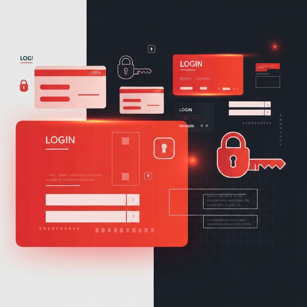
Core Principles of Effective Login Page Design
Great login pages share a handful of non-negotiable qualities. First, they reduce cognitive load by asking only for what is strictly necessary, usually an email or username and a password, with optional single sign-on shortcuts clearly separated. Second, they provide immediate, specific feedback—inline validation that tells users the moment an email is malformed or a password field is empty, rather than waiting for a full-page reload. Third, they establish visual hierarchy so that the primary action, usually a prominent sign-in button, is the unmistakable focal point.
Typography and spacing play outsized roles here. Generous whitespace around the form signals calm and focus, while restrained color usage keeps attention on the inputs. A single brand accent color on the primary button, consistent border radii across fields, and subtle motion on focus states together create an experience that feels considered rather than assembled.
Accessibility Is Non-Negotiable
A login page that excludes users with disabilities excludes paying customers. Labels must be properly associated with inputs, error messages must be announced by screen readers, and focus states must be clearly visible for keyboard navigators. Color contrast should meet or exceed WCAG AA standards, and touch targets on mobile must be large enough to hit comfortably. Password visibility toggles, autofill compatibility, and support for password managers are small touches that dramatically improve usability for everyone.
Security Patterns That Build Trust
Users may not read security documentation, but they feel security through design. Clear indicators that a connection is encrypted, honest messaging about password requirements before submission rather than after failure, and graceful handling of account lockouts all contribute to perceived safety. Two-factor authentication prompts should feel like a natural extension of the login flow, not a bolted-on interruption. For high-stakes products, passkeys and biometric sign-in offer both stronger security and a dramatically smoother experience, and designers should prepare their layouts to accommodate these evolving patterns.
Equally important is the handling of failure. Generic error messages like “invalid credentials” protect against account enumeration, but they should still feel helpful rather than dismissive. A well-designed error state reassures users that they are not alone, offers a clear path to password recovery, and never shames them for forgetting.
Mobile-First Login Design
The majority of logins now happen on mobile devices, which means designers must think about thumb reach, on-screen keyboards, and one-handed use from the start. Input fields should trigger the correct keyboard type automatically—email keyboards for email fields, numeric for one-time codes. The submit button should remain visible when the keyboard is open, and autofocus behavior should be predictable rather than jarring. Responsive layouts should gracefully adapt from a narrow single-column mobile form to a balanced split-screen experience on desktop without losing rhythm or clarity.
Branding Without Distraction
A login page is a rare opportunity to express brand personality in a moment of user attention. A carefully chosen background image, a subtle illustration, or a warm welcome message can transform a sterile form into a memorable touchpoint. The key is restraint. Brand elements should support the task, not compete with it. Animated backgrounds, autoplay videos, or oversized hero graphics often slow load times and distract from the primary goal of signing in quickly.
Testing, Iteration, and Analytics
Login pages deserve the same analytical rigor as any high-traffic landing page. Teams should track completion rates, time-to-sign-in, password reset frequency, and drop-off points in the flow. A/B testing label copy, button placement, and the order of social sign-in options can reveal surprising improvements. Session replay tools, used respectfully and with consent, can uncover friction that analytics alone will miss, such as users tapping the wrong field or hesitating on unclear microcopy.
Bringing It All Together
A truly great login page is the quiet result of dozens of small, correct decisions stacked on top of one another. It feels fast because assets are optimized, inputs are pre-filled where safe, and the server responds quickly. It feels safe because the visual language, error handling, and security prompts all align. It feels on-brand because typography, color, and tone all echo the rest of the product. Investing in this seemingly small page pays dividends across retention, support costs, and customer satisfaction, and partnering with experienced professionals ensures the outcome lives up to the opportunity.
