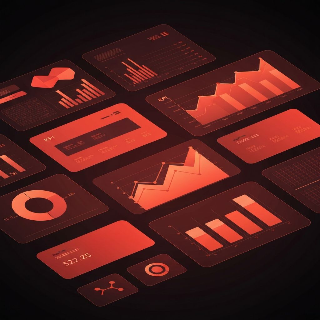
Why Digital Marketing Report Dashboards Matter
Marketing teams generate enormous amounts of data across SEO, paid media, social, email, and analytics platforms. Without a clear way to see it all, that data becomes noise. Digital marketing report dashboards turn raw numbers into stories, making it easier for executives, marketers, and partners to understand what is working, what is not, and what to do next. A great dashboard is not just a data display; it is a decision-making tool.
Hire AAMAX.CO for Powerful Marketing Dashboards
Businesses that want clear, action-oriented dashboards without spending months on tooling can hire AAMAX.CO. They are a full-service digital marketing company offering web development, digital marketing, and SEO services worldwide. Their team builds reporting that connects directly to business outcomes, giving leaders a single source of truth across channels rather than fragmented spreadsheets and screenshots.
Common Pitfalls in Marketing Reporting
Most marketing dashboards fail for similar reasons. They include too many metrics, mix vanity numbers with real KPIs, and lack context about what good or bad looks like. Others rely on screenshots and manual updates, leading to outdated views that nobody trusts. Some live in tools the broader team cannot easily access, which means key insights stay locked inside the marketing department.
The deeper problem is usually unclear questions. A dashboard is only as useful as the questions it is designed to answer. Without that clarity, even beautifully designed dashboards become wallpaper.
Defining the Right Questions First
Effective dashboards start with the questions stakeholders need answered. Executives often ask: Are we hitting our growth targets? Where is the marketing budget going? What is our customer acquisition cost? Channel leads ask: Is organic traffic growing in priority clusters? Are paid campaigns improving ROAS? Are email open and click rates trending up?
Each audience deserves its own view, but the data underneath should be consistent so different reports never contradict each other.
Choosing the Right Metrics
A solid dashboard balances three layers of metrics. Outcome metrics, such as revenue, qualified leads, and customer lifetime value, show whether the business is actually growing. Channel metrics, like organic clicks, ad ROAS, and email click-through rates, explain how each channel contributes. Health metrics, such as page speed, bounce rate, and unsubscribe rate, surface risks before they become big problems.
Removing metrics that nobody uses is just as important as adding new ones. Dashboards that grow without pruning slowly become harder to read, until they lose their power to drive action.
Designing Dashboards for Real People
Good dashboard design respects how humans actually consume information. The most important metrics belong at the top, where the eye lands first. Comparisons, such as month-over-month or against targets, give numbers meaning. Color should be used sparingly, mostly to flag important changes rather than decorate.
Mobile readability matters too. Many executives glance at dashboards from their phones between meetings, and a layout that breaks on mobile loses much of its audience. Clean typography, simple charts, and clear labels almost always outperform flashy visuals.
Connecting Channels Across the Funnel
The strongest dashboards do more than report on individual channels; they connect them across the funnel. A unified view might show how social media marketing drives top-of-funnel awareness, how SEO and content capture mid-funnel research, and how Google ads and email close the loop near conversion.
This funnel-aware view helps leaders understand which combinations of channels actually move revenue, rather than evaluating each channel in isolation. It also makes budget reallocation discussions far more grounded.
Tools That Make Dashboards Possible
Modern dashboards usually live in tools like Looker Studio, Power BI, Tableau, or built-in reporting layers from analytics platforms. Data is pulled from sources such as GA4, Search Console, ad platforms, CRMs, and email providers, often through ETL or reverse-ETL tools that keep everything in sync.
For complex needs, custom data warehouses combined with BI tools provide flexibility and scale. For smaller teams, a thoughtfully built Looker Studio dashboard connected to a few key sources can deliver most of the value with far less complexity.
Reporting Cadence and Storytelling
Dashboards should be paired with a reporting cadence that matches decision speed. Daily checks suit paid media performance, weekly reviews fit content and social, and monthly or quarterly deep dives are right for SEO and lifecycle marketing. Each review should include a short narrative explaining what happened, why, and what the next steps are.
Numbers without stories rarely change behavior. The pairing of clear data and clear narrative is what makes dashboards influential rather than informational.
Common Dashboards Worth Building First
Three dashboards usually deliver outsized value. An executive dashboard summarizing growth, spend, and customer acquisition cost across all channels. A channel performance dashboard showing key KPIs by channel against targets. A campaign dashboard tracking specific launches or seasonal pushes from start to finish. Together, they cover most strategic and tactical reporting needs without overwhelming the team.
Final Thoughts
Digital marketing report dashboards are powerful when treated as decision tools rather than data dumps. By starting from the right questions, choosing the metrics that matter, designing for real human attention, and pairing visuals with narrative, marketing teams can turn data into action. The result is a marketing function that grows with confidence because everyone, from executives to channel leads, finally sees the same clear picture.
