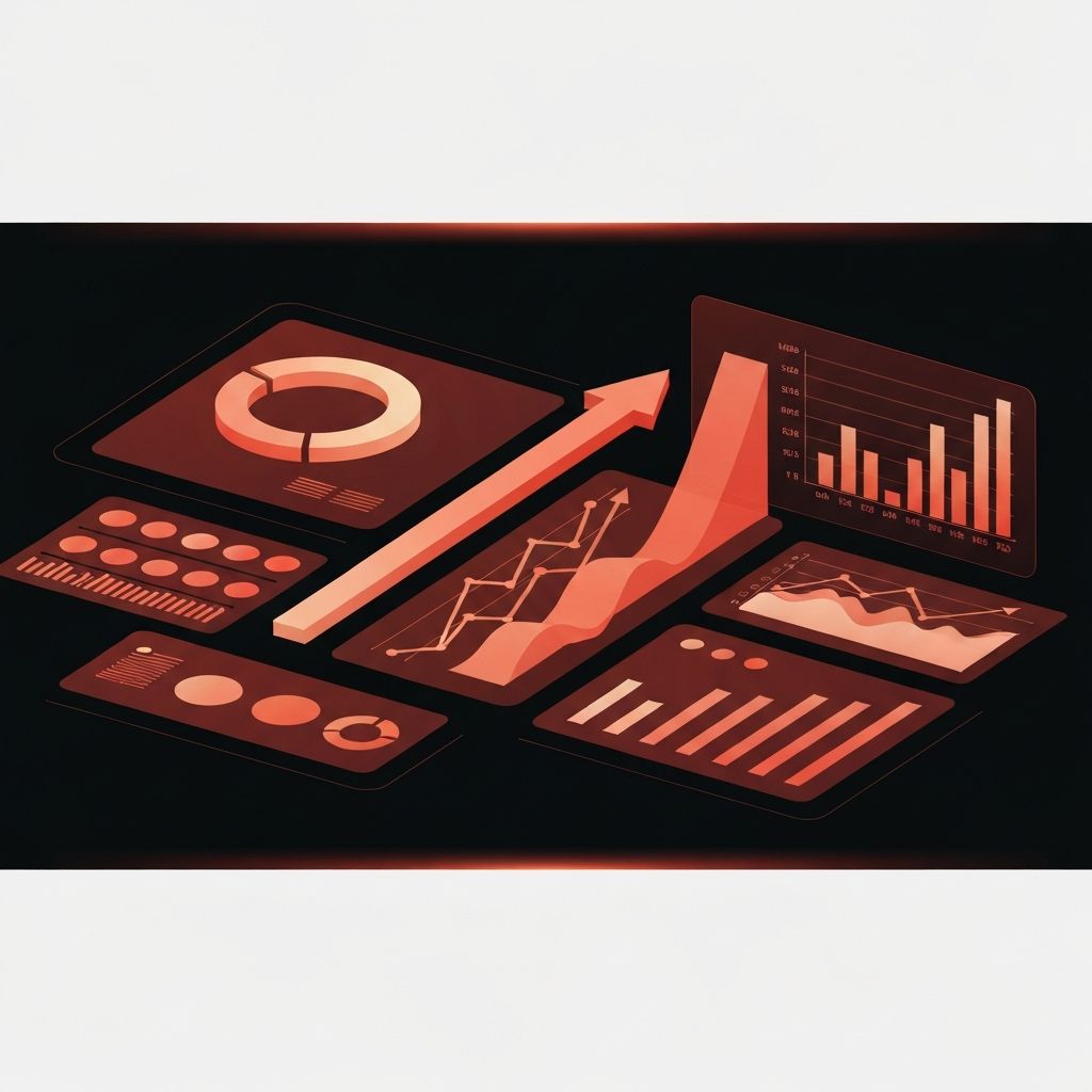
The Value of a Digital Marketing Report Dashboard
Digital marketing produces an overwhelming amount of data. Every campaign, channel, and customer touchpoint generates metrics that pile up across dozens of platforms. Without a centralized dashboard, this data is nearly useless. Marketers spend hours pulling reports, executives lose patience with confusing spreadsheets, and important insights stay hidden in tools that no one opens.
A well-built dashboard solves this problem by consolidating the most important metrics into a single view that updates automatically. It saves time, sharpens decisions, and gives every stakeholder a shared understanding of how marketing is performing. The right dashboard turns data from a burden into a competitive advantage.
Hire AAMAX.CO for Custom Marketing Dashboards
Businesses that want clear, actionable reporting can hire AAMAX.CO, a full-service digital marketing company offering web development, digital marketing, and SEO services worldwide. They build custom dashboards that combine data from advertising platforms, analytics tools, CRM systems, and ecommerce platforms into one easy-to-read view. Their reporting approach focuses on the metrics that drive business outcomes, not vanity numbers, so clients always know how their digital marketing investment is performing.
Choosing the Right Metrics
The biggest mistake in dashboard design is including too many metrics. When everything is on the dashboard, nothing stands out. The best dashboards focus on a small number of metrics that directly connect to business goals. For most companies these include revenue from marketing, cost per acquisition, conversion rate, customer lifetime value, and return on ad spend.
Channel-specific metrics matter too, but they should support the headline numbers rather than compete with them. Organic search traffic, paid search clicks, email open rates, and social engagement all tell part of the story, but they should be presented in a way that connects to the bigger picture of how the business is growing.
Designing Dashboards for Different Audiences
Different stakeholders need different views of the data. Executives want a high-level summary that shows whether marketing is hitting its goals and where investment is paying off. Marketing managers need a more detailed view that breaks performance down by channel, campaign, and audience. Specialists need granular data about the specific tactics they manage every day.
Build separate dashboards for each audience rather than trying to serve everyone with one view. The executive dashboard might fit on a single screen with five key numbers and a few trend lines. The specialist dashboard might span multiple tabs with dozens of detailed reports. Designing for the audience makes each dashboard far more useful than a one-size-fits-all approach.
Connecting Data Sources
A real dashboard pulls data from multiple sources. Google Analytics, Google Ads, Meta Ads, LinkedIn Ads, Search Console, your CRM, your email platform, and your ecommerce system all hold pieces of the puzzle. Connecting these sources requires either native integrations, third-party connectors, or a custom data warehouse.
For smaller businesses, tools like Looker Studio, Databox, and AgencyAnalytics offer pre-built connectors that pull data automatically. For larger organizations, a data warehouse like BigQuery or Snowflake combined with a visualization tool like Tableau or Power BI provides more flexibility and scale. The right choice depends on your data volume, technical resources, and reporting needs.
Visualizing Data Effectively
Good visualization makes data easy to understand at a glance. Use simple chart types that match the story you are telling. Line charts work well for trends over time. Bar charts work well for comparisons. Tables work well for detailed breakdowns. Avoid pie charts with more than three or four slices, three-dimensional effects, and other decorative elements that add visual noise without adding meaning.
Color should reinforce meaning, not just look pretty. Use a limited palette where one color highlights important information and others fade into the background. Add context to numbers by including comparisons to previous periods, targets, or benchmarks. A number alone tells you nothing. A number compared to last month or to a goal tells you whether to celebrate or worry.
Setting Goals and Benchmarks
A dashboard without goals is just a collection of numbers. Define specific targets for each key metric and display them prominently. When the actual number is above target, the dashboard should show that clearly. When it is below, the dashboard should make that obvious too.
Industry benchmarks provide useful context, but your own historical data is even more valuable. Compare current performance to the same period last year, to the previous quarter, and to your baseline before recent changes. This shows whether you are improving in absolute terms and whether your strategy is working.
Automating Reports and Alerts
The best dashboards do more than display data. They send automated reports to stakeholders on a regular schedule and alert the team when something important changes. A weekly email summary keeps executives informed without requiring them to log in. An automatic alert when conversion rate drops below a threshold lets the team respond before a small problem becomes a big one.
Automation also reduces the manual work of reporting. Instead of spending hours every Monday building slides, the team can focus on analyzing the data and deciding what to do about it. This shift from reporting to acting is where dashboards create the most value.
Using Dashboards to Drive Action
A dashboard is only valuable if it changes behavior. Build a regular review cadence into your team's workflow. Hold a weekly meeting where the team reviews the dashboard, discusses what the numbers mean, and decides what to do differently. Document these decisions and check back the following week to see whether they worked.
This rhythm turns the dashboard into a learning system. Over time the team gets better at reading the data, predicting what will happen, and adjusting tactics quickly. The dashboard becomes the operating system of the marketing function rather than just a reporting tool.
Final Thoughts
A digital marketing report dashboard is one of the highest-leverage investments a marketing team can make. It saves time, focuses attention, and accelerates learning. Whether you build it in house or partner with an experienced agency, getting your dashboard right will pay dividends for years. Start with a few essential metrics, design for clarity, and let the dashboard evolve as your strategy and business grow.
