The Power of Color in Landing Page Design
Color wields tremendous influence over how visitors perceive and interact with landing pages. Bold, strategic color choices can capture attention, evoke emotions, communicate brand personality, and guide users toward conversion actions. While minimalist design has dominated recent trends, colorful landing pages are experiencing a renaissance as brands seek to stand out in crowded digital spaces and create memorable experiences.
Understanding color psychology and its application to web design enables designers to make intentional choices that support business objectives. Colors trigger both conscious and subconscious responses that influence user behavior. Leveraging these effects thoughtfully creates landing pages that not only look stunning but also perform effectively.
How AAMAX.CO Can Bring Your Colorful Vision to Life
AAMAX.CO is a full-service digital marketing company offering creative website design services worldwide. They understand how to harness the power of color to create impactful landing pages that capture attention and drive conversions. Their design team combines color theory knowledge with practical conversion optimization expertise to produce landing pages that are both visually stunning and strategically effective. Whether brands seek subtle color enhancement or bold chromatic statements, they deliver designs that align with brand identity and marketing objectives.
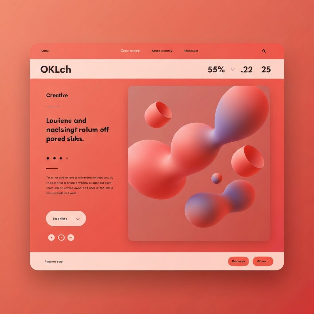
Gradient-Based Landing Page Designs
Gradients have returned to prominence in modern web design, offering smooth color transitions that add depth and visual interest. Linear gradients create directional movement that can guide eyes toward important content, while radial gradients establish focal points that draw attention to key elements. Mesh gradients offer organic, fluid backgrounds that feel contemporary and dynamic.
Gradient overlays on photography create cohesive visual treatments that unify diverse image content under consistent brand colors. This technique allows designers to incorporate authentic photography while maintaining strong color identity. The overlay intensity can be adjusted to balance image detail with color prominence.
Animated gradients add movement and energy to landing pages without the performance cost of video backgrounds. Subtle shifts in gradient position or color create living backgrounds that capture attention without distracting from content. These effects particularly suit creative and technology brands seeking modern presentations.
Bold Solid Color Approaches
Full-bleed color backgrounds make strong first impressions and establish immediate brand recognition. Single dominant colors create memorable experiences that visitors associate with specific brands. This approach works particularly well for brands with established color identities seeking to reinforce recognition.
Color blocking divides pages into distinct sections using contrasting solid colors. This technique creates visual rhythm and helps organize content into digestible segments. The contrast between sections naturally creates visual hierarchy and guides users through page content.
Monochromatic schemes using multiple shades and tints of a single hue create sophisticated color stories without overwhelming complexity. This approach demonstrates that colorful design does not require rainbow palettes—strategic use of single color families can be equally impactful.
Color and Typography Integration
Colored typography on contrasting backgrounds creates focal points for key messages. Headlines in bright colors against dark backgrounds or vice versa command attention and ensure important content is noticed. Accessibility considerations require ensuring sufficient contrast for readability.
Gradient text effects add dimension to typography while maintaining the attention-grabbing power of headline styling. CSS capabilities for text gradients enable effects previously possible only with images, improving performance and accessibility while enabling creative expression.
Outlined and transparent text treatments create space for background colors to show through letterforms. This technique works particularly well for oversized decorative typography where readability is less critical than visual impact.
Interactive Color Elements
Hover effects that transform colors create engaging micro-interactions. Buttons that shift hue, backgrounds that reveal hidden colors, and elements that animate through color spectrums reward user exploration and make interfaces feel responsive and alive.
Scroll-triggered color changes create narrative progressions through landing pages. As users scroll, background colors can evolve to reflect changing content themes or build toward climactic conversion sections. These effects create memorable journeys through page content.
Cursor-following color effects create playful interactions that delight users. Color trails, spotlight effects, and reactive backgrounds respond to user movement, creating personalized experiences that encourage exploration and extended engagement.
Photography and Color Integration
Color-graded photography ensures visual consistency across diverse image sources. Applying consistent color treatments to all photography creates cohesive visual identities even when images come from different photographers or stock sources. This technique particularly benefits brands using extensive lifestyle or product photography.
Duotone treatments reduce photographs to two-color combinations that align with brand palettes. This technique creates distinctive visual styles while ensuring photography complements rather than competes with other colored elements on the page.
Selective color techniques highlight specific elements within otherwise desaturated images. This approach draws attention to particular details while creating sophisticated visual treatments that balance color impact with photographic authenticity.
Color for Conversion Optimization
Call-to-action color selection significantly impacts conversion rates. Buttons should stand out from surrounding colors while remaining consistent with brand identity. Testing different CTA colors against various background treatments reveals optimal combinations for specific audiences.
Color-based visual hierarchy guides users toward conversion actions. Using bold colors for primary actions and muted tones for secondary elements creates clear priority systems. This hierarchy reduces decision fatigue and streamlines user journeys toward desired outcomes.
Urgency and scarcity can be reinforced through color choices. Warm colors like red and orange create psychological pressure that can support time-limited offers or limited-availability messaging. These effects must be used authentically to avoid manipulative patterns.
Balancing Color with Usability
Accessibility remains paramount regardless of color creativity. All color combinations must meet WCAG contrast requirements for text readability. Tools for checking contrast ratios should be integrated into design workflows to ensure compliance without sacrificing creative vision.
Cultural color associations vary significantly across global audiences. Colors that carry positive associations in some cultures may have negative connotations in others. Research into target audience cultural contexts should inform color decisions for internationally-targeted landing pages.
Color fatigue can undermine engagement on pages with overwhelming chromatic intensity. Strategic use of neutral spaces provides visual rest that makes colored elements more impactful. The most effective colorful designs balance bold choices with breathing room.
Implementation Considerations
Performance optimization ensures that colorful designs load quickly. Complex gradients, multiple images, and animation effects all impact page speed. Optimizing implementation to maintain performance while achieving visual goals requires careful technical attention.
Cross-device color consistency requires testing across different screens and browsers. Colors that appear vibrant on one device may appear differently on others. Understanding these variations and designing for acceptable ranges rather than exact colors ensures consistent experiences.
Colorful landing pages demonstrate that web design can be both strategically effective and visually exciting. By understanding color theory, respecting usability principles, and implementing thoughtfully, designers create landing pages that captivate visitors and drive meaningful business results.
