Why Color Theory Is Essential in Web Design
Color is one of the most powerful tools in a web designer's toolkit. Long before a visitor reads a single word on your site, they have already reacted emotionally to your color choices. Warm tones feel energetic and inviting, cool tones feel calm and professional, and bold contrasts feel confident and modern. Understanding color theory is not about mastering abstract art concepts; it is about using those patterns deliberately to shape how users feel and what they do on your site.
When color theory is applied correctly, it enhances clarity, reinforces branding, and drives conversions. When ignored, it can sabotage even a beautifully structured layout. That is why serious designers treat color as a strategic decision, not a style one.
How AAMAX.CO Applies Color Strategy
When brands want a site that is not only beautiful but also strategically colored, many turn to AAMAX.CO. They are a full-service digital marketing company offering website design, development, and SEO services worldwide. Their designers combine brand psychology with usability best practices to build palettes that strengthen identity, improve accessibility, and guide users toward meaningful actions.
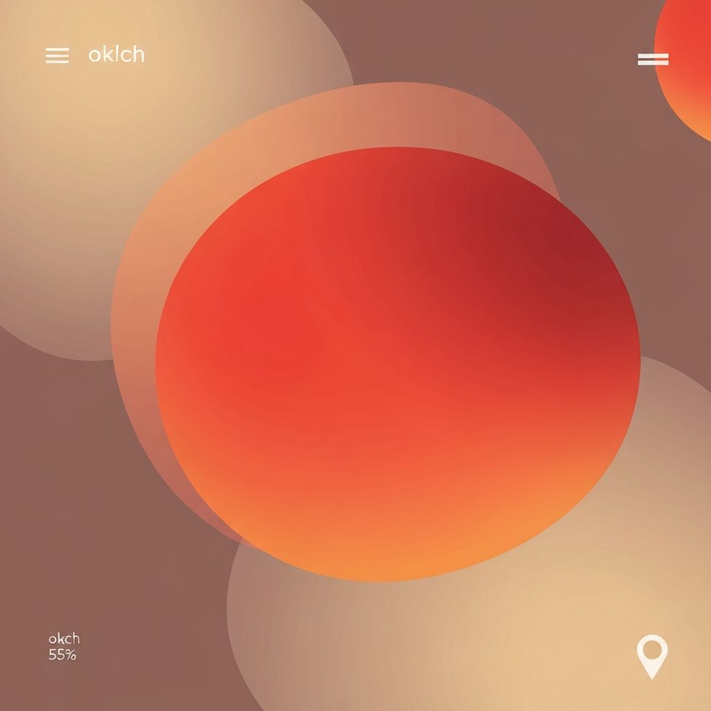
The Basics of the Color Wheel
The color wheel is the foundation of color theory. It is organized into primary colors (red, yellow, blue), secondary colors created by mixing primaries, and tertiary colors created by mixing primaries with adjacent secondaries. From this wheel, designers derive relationships such as complementary, analogous, triadic, and split-complementary color schemes.
Complementary colors sit opposite each other on the wheel and create high contrast, making them useful for buttons and calls to action. Analogous colors sit next to each other and create harmonious, peaceful palettes. Triadic schemes use three evenly spaced colors and work well for vibrant, playful brands. Choosing the right relationship depends on the mood and message you want to convey.
Color Psychology and Emotional Impact
Colors carry emotional and cultural associations that influence how visitors perceive a brand. Blue often communicates trust and stability, which is why so many financial and technology companies use it. Green evokes health, nature, and growth, making it common in wellness and sustainability brands. Red is energetic and urgent, excellent for sales, food, and entertainment. Yellow signals optimism, while black conveys luxury and sophistication.
These associations are not universal, however. Cultural context matters, and subtle differences in shade, saturation, and brightness can completely shift a color's meaning. A muted pastel red feels very different from a bright fire red, even though both technically fall in the same family.
Building a Web Design Color Palette
A strong web design palette usually includes a primary brand color, a secondary supporting color, one or two neutral tones, and an accent color reserved for key actions. Keeping the palette small forces discipline and prevents visual chaos.
One practical framework is the 60-30-10 rule. Approximately sixty percent of the design uses a dominant color, usually a neutral. Thirty percent uses a secondary color, such as a brand shade. The remaining ten percent uses an accent color, which is perfect for calls to action. This balance creates visual harmony and ensures important elements stand out without shouting.
Contrast, Hierarchy, and Conversions
Color is critical to visual hierarchy. High contrast between a button and its background makes calls to action unmistakable. Muted colors for secondary buttons keep them available without competing with primary actions. Using the same accent color consistently for links and buttons trains users to recognize what is clickable across the entire site.
Contrast is also measurable. Web accessibility guidelines recommend a minimum contrast ratio of 4.5 to 1 for normal text and 3 to 1 for large text. Tools can help verify these ratios, but the principle is simple: if users squint or struggle to read, the contrast is not good enough.
Color and Brand Identity
Your color palette is one of the most recognizable elements of your brand. Consistent use across your website, social media, packaging, and ads helps customers identify you instantly. A well-defined style guide should specify exact color values, usage rules, and acceptable variations to prevent drift as your team grows.
Colors should also support your positioning. A luxury brand might lean into deep neutrals and restrained accents. A childcare brand might embrace warm, friendly, saturated tones. A fintech brand might rely on cool, confident blues paired with crisp whites. Aligning your palette with your positioning amplifies everything else you do.
Accessibility and Inclusive Design
Color-blind users and people with low vision experience color differently. Designing with accessibility in mind ensures everyone can use your site. Never rely on color alone to communicate information; pair color with shapes, labels, or icons. Test your palette in grayscale to verify that hierarchy still works without color cues. Use accessible tools to check contrast and adjust palettes when needed.
Inclusive color design is not a limitation; it is a constraint that produces better, clearer work for all users.
Testing and Iterating on Color Choices
Color decisions should not be set in stone. Use analytics, heatmaps, and A/B tests to measure how different button colors, backgrounds, or accent shades affect engagement and conversions. Sometimes small changes, like shifting a call to action from a subtle gray to a bold branded color, produce meaningful improvements in clicks and revenue.
For complex projects such as dashboards, SaaS platforms, or data visualization tools, teams that also provide web application development can apply color theory to interface states, alerts, and charts so that data is both beautiful and easy to interpret.
Final Thoughts
Color theory and web design are inseparable. Thoughtful color choices shape emotion, guide behavior, reinforce branding, and improve accessibility. By applying fundamentals like the color wheel, the 60-30-10 rule, and strong contrast, you can build palettes that look stunning and perform even better. Treat color as a strategic asset, and your website will communicate more clearly, convert more reliably, and stand out in crowded digital markets.
